
Designing around frustration
When I was a kid I used to get into play fights with my little cousin.
Our play fights would get heated and, occasionally, she would get hurt. Seeking to avoid trouble at all costs, I would do everything in my power to get her to laugh instead of cry.
I can’t count the amount of times I have been ferociously waiting for an app to load or a video to buffer.
Granted, this is pretty high up there on the list of my first world problems… but I have things to do and places to be!
Staring at the word “loading” leaves me helpless, impatient, and frustrated with your shitty app!
About a month ago, I was mindlessly scrolling on Amazon and reached what seemed to be end of Amazon’s “recommended” items.
For a second I thought Amazon ran out of semi-useless things to sell me. Then I quickly found myself spiraling down the nine circles of hell loading.
All the sudden, something made me giggle.
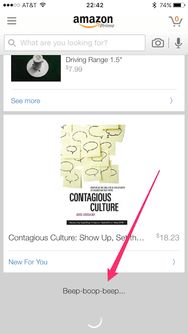
Beep-boop-beep…
Some saintly designer at Amazon knew reading the word “loading” would piss me off.
Instead of doing what countless others in the software industry do, this beautiful mind decided to turn my frown upside down.
Why doesn’t every error/status message do this?
Forgot your password? Click here
Could just as easily become…
Passwords suck, right? Forgetting one happens to the best of us. How about we take a second and get you sorted.
Designing around frustration seems like something obvious to get behind. Yet, every day I am still bombarded with boring, frustrating, and useless error/status messages.
If you want the people to enjoy your app, design for scenarios where things go wrong. Make error messages personable and friendly. Make people giggle.
If you can make someone laugh when they’re prepared to cry you will make their day. Heck, they may even write about it online!
Be like Amazon and beep-boop-beep people out of frustration and into happiness.